…while Mr. Ritchie liked the new look, he couldn’t pull the trigger on making it happen…
As we go though our many years of project files, we sometimes stumble on projects that never were. This one is a mockup of a website for Philip Johnson Alan Ritchie Architects. In the past I’ve collaborated with Mr. Ritchie on a variety of projects and felt that the impression they were giving with their current website was less than the reputation of their firm, and thus required a complete update in organization, scale and features appropriate to today’s web browsers and technology. The result was this quick mockup to show him what it could look like.
While Mr. Ritchie liked the new look, he couldn’t pull the trigger on making it happen, perhaps because of an existing contract with a local web developer, or perhaps because he didn’t understand the steps that would have to happen to make the new design part of his company’s corporate image.
The design features of this layout are:
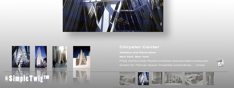
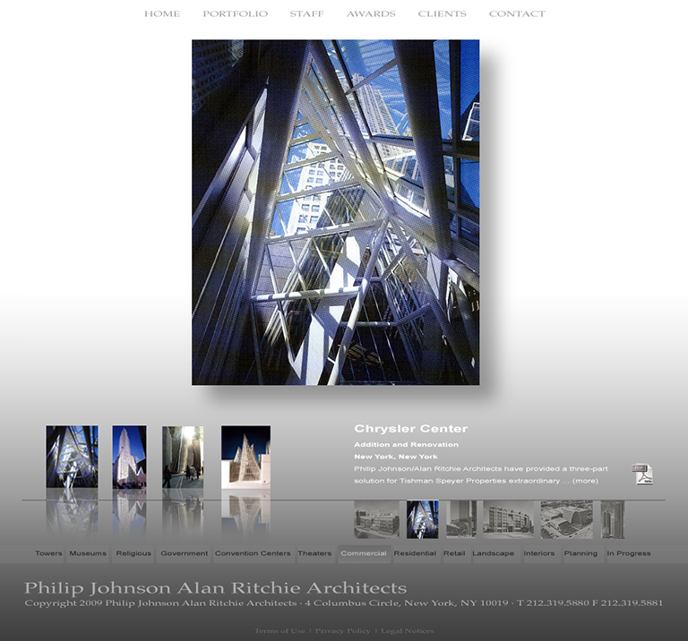
1) Featured image is front and center, floating to push it closer to the observer.
2) Easy access to additional images with their own reflection.
3) The projects within this particular category are easy to access, and are located below and connected to a thin line. Together numbers 1, 2 and 3 prevent a user from getting lost on the website, they can easily navigate to see new project.
4) A short description give a user valuable data, while the PDF link provides them with the full profile and details of the project they can use to help promote the firm to others.
5) Below these images are the main categories of this firm, easy to access and always located at the same location no matter what page a user is on. This aspect means that a user will never get lost in the layers of a website.
6) Finally the vital information of the firm, consistent on every page means a user always knows where to get the information they need to reach the architect. In fact one could say this information, the firm’s name, is the base of the building supporting all that is above.
The idea that we can and do create websites and other graphic components might be a surprise to some, but for us it is only a small extension of what we already do. We are Architect, so we understand organization, we are renderers, so we do digital illustrations and fully understand graphics, and we build our own websites since 1997, so understand the tools one needs to make and create a website. For our own website, you might wonder why we do not have many pages. Actually our website has 685 unique web pages, most of the links are of low priority and don’t command the access that the important pages have, because he also have priorities as a business, but if you’d like to see some of our web site work, then visit SimpleTwig™ WEB: http://simpletwig.com/web.html
Let us know what you think of the above design, do you like the gray scheme allowing the images to take the stage? How about the floating quality of the feature image, or the reflections of the secondary images? Do you like the organizational aspect, or do you think a traditional ‘top links’ are the only way to do a website?