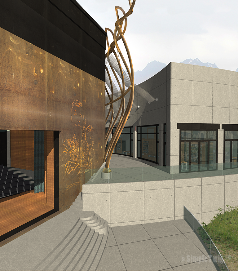
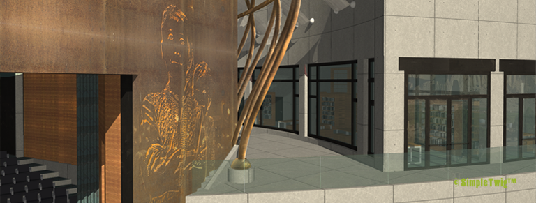
Color: We take the natural dull ochre color of the surrounding mountains and local built structures and enhance it by saturating this color into a golden braised surface…for the main metal work and features of this architectural composition, and desaturate this ochre color for the background masonry work of our composition to achieve a fundamental relationship with the setting of this project. By lightening the masonry through desaturation, we separate this public building from local private structures thus allowing it to become a significant public structure without creating a distraction to this beautiful valley. This lighter color echoes many of the stones gravel one sees around the site.

Be sure to subscribe to this blog for further articles and releases of each image created for this competition to learn more. Thank you.

